A redesigned photo gallery
Hot on the heels of the new blog, we’ve been busy in the app too — and your photos have been given pride of place. The gallery has had a complete makeover.
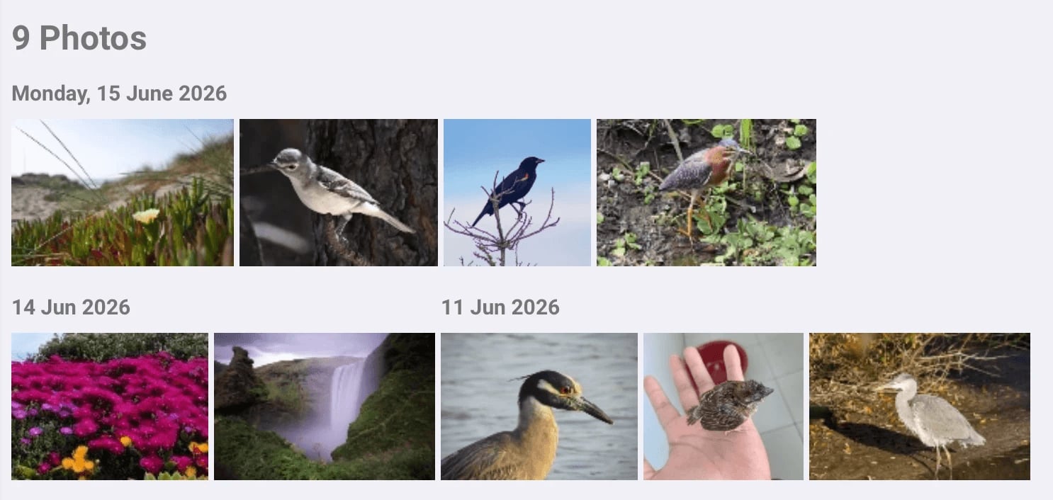
A tiled gallery, grouped by day
Your pictures now appear in a tiled gallery, grouped by day, that makes the most of whatever screen you’re on. Recent days sit at the top with larger thumbnails, and earlier days follow in a neat, scannable grid — so flicking back through a trip or a year of sightings feels natural rather than like wading through a single long list.
Open full-screen, with a smooth zoom
Click any photo and it opens full-screen, zooming smoothly out from the thumbnail you picked. From there you can move between pictures with the previous and next controls — and an “8 of 10” counter keeps track of where you are — all without leaving the viewer.
Lighter and faster
The whole gallery is now smoother and lighter. Photos load only as you need them, so the app stays quick and responsive whether you have a handful of pictures or thousands. The same work has made the maps feel snappier too, and along the way we fixed a long-standing niggle where maps could turn blank when you zoomed all the way in.
On every platform
These changes land everywhere Bird Journal lives — the web app, Windows and Mac — so however you keep your sightings, your photos get the same fresh treatment.
We hope the new gallery makes it a pleasure to look back over your photos. As always, we’d love to hear what you think — and there’s more to come.